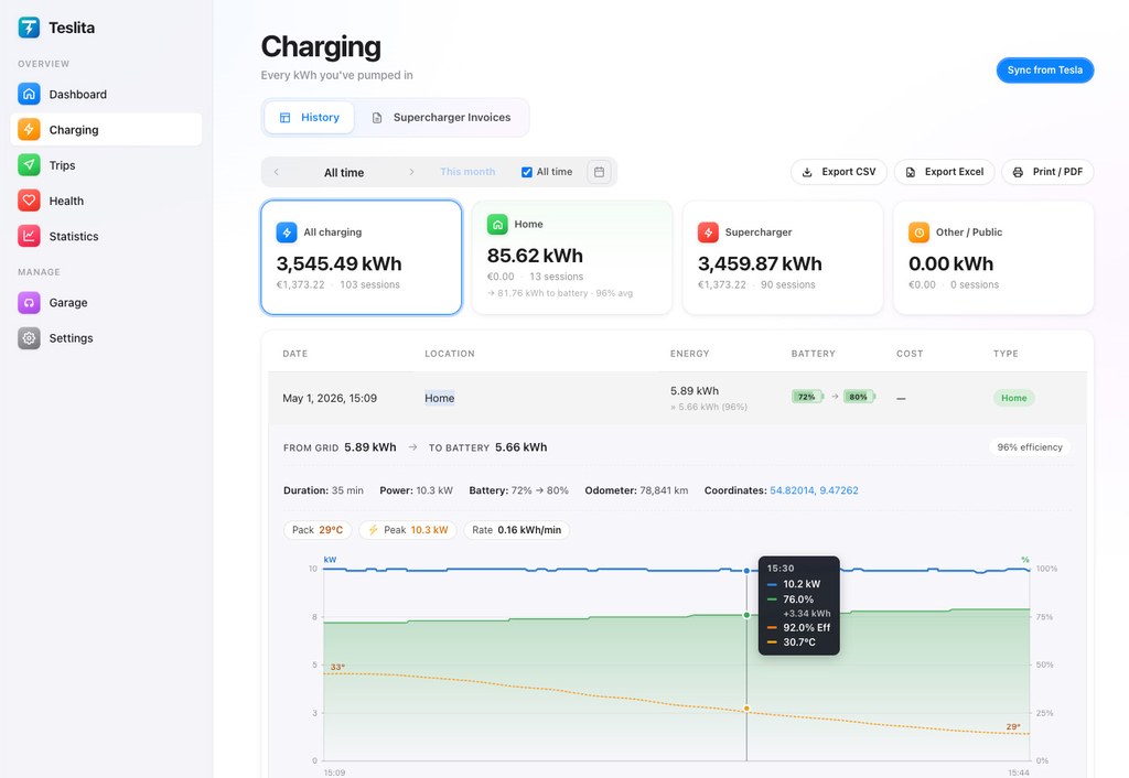
The headline view: every DC session overlaid on one chart
5 featuresA single charging session in isolation tells you almost nothing — was 142 kW good for that car, that stall, that battery temperature, that state of charge? Teslita answers the question the only honest way: by drawing your last ten DC sessions on the same kW-vs-battery-% axes, with the site's baseline underneath. The fast sessions look fast. The slow ones look slow. The one that should have peaked at 220 kW and limped along at 70 stands out the moment the page loads.
Ten most recent sessions overlaid Auto
The chart draws each of your last ten DC fast-charge sessions as its own kW-vs-battery-% line on shared axes. The curves cluster where your car behaves normally and diverge where something was off — a different site, a cold pack, a sandbagged stall — without you having to read a single number.
Site median underneath for context
The faint band under your curves is the median curve for that Supercharger site across every Tesla session Teslita has seen there. Your session above the band means a faster-than-typical stall; below it means slower than typical. Per-site context, every time you pull up the chart.
Peak kW, ramp-up, taper points called out
Each session's peak kW, the battery-% at which the taper started, and the battery-% at which it dropped below 50 kW are labelled on the curve. The three numbers are what road-trip planners and Supercharger forum threads actually argue about — Teslita prints them on the chart instead of making you eyeball it.
Filter by car, site, firmware, season
Two cars on one account, a long-range pack versus the standard one, before and after a holiday firmware update, July versus February — toggle the filters above the chart and the overlay updates. Honest comparisons, not the noise of mixing a cold winter session with a hot summer one.
Tap a curve, get the full session detail
Click any line on the overlay and the session detail page opens — minute-by-minute kW, battery temperature where Tesla reports it, pack voltage, the stall the car was on, the firmware version it was running. The chart is the lead-in; the detail is right behind it.
Slow-Supercharger detection — flagged for you
4 featuresAuto-flagged when peak kW drops well below the site's baseline Flagged
When a DC session's peak kW falls a clear margin below the same site's typical curve for cars with the same battery and state of charge, Teslita flags the session as unusually slow. The flag is visible in the session list and on the overlay chart, so you can spot the underperforming stalls without scrolling through every chart by hand.
Per-stall breakdown when Tesla reports it
For sites where Tesla's telemetry includes the stall number, Teslita groups sessions by stall. If one stall at your favourite Supercharger consistently peaks 40 kW below the others, the per-stall view shows it — and you know which post to avoid next time.
Concrete numbers to report to Tesla
A flagged session links to a one-page summary you can paste straight into a service request — site name, stall number, timestamp, peak kW, expected kW from the site baseline, the battery temperature at start. Tesla support can act on that; they cannot act on "it felt slow."
Preconditioning effect, before and after
If you started navigating to the Supercharger before arriving (so the pack pre-warmed), Teslita splits your sessions into preconditioned and not, and shows the difference. Useful in winter, where a non-preconditioned arrival can lose you 15 minutes on a 30-minute charge — and the chart proves it.
AC charging losses, per session
4 featuresGrid-side kWh vs kWh-to-battery
For every AC session — home wallbox, destination charger, three-phase EVSE — Teslita records both the energy delivered from the grid and the energy that actually made it into the pack. The gap is what your charging cable, the on-board charger and the pack-conditioning circuit converted to heat. Visible per session and as a median across your whole AC history.
Median AC efficiency across your sessions
On the home-charging summary card, a single Efficiency percentage shows the median ratio of pack kWh to grid kWh across your AC sessions. The number that lets you sanity-check your home-charging cost — and the number that drops sharply if your wallbox is misconfigured or your cable is overheating.
Three-phase vs single-phase wallbox comparison
If you have both a single-phase and a three-phase wallbox in your history — or move between them — the per-session breakdown makes the efficiency gap obvious. Three-phase wallboxes typically run closer to 92–93%, single-phase 16 A closer to 86–88%, and Teslita shows the numbers from your own sessions rather than a manufacturer brochure.
On-board charger taper visible
A 16 A on-board charger holds 11 kW for most of the curve and tapers right at the end; a 32 A unit holds 22 kW similarly. The AC curve view plots the per-minute charging power, so you can see exactly when your car backed off — and whether it was the wallbox throttling, the charge limit kicking in, or a thermal cutback.
V3 vs V4, 250 kW vs 350 kW — your numbers
4 featuresV4 sessions tagged automatically
Sites where Tesla's telemetry indicates a V4 post (the post type is in the session payload at many sites) get a V4 tag in the session list and a distinct colour on the overlay chart. You see at a glance whether your "350 kW" run actually held above 250 kW or quietly tapered to V3-like numbers.
V3 baseline drawn for comparison
On a V4-tagged session, the overlay also draws the median V3 curve for the same battery and state of charge. If your V4 session was no faster than a V3 one — and a lot of them aren't, because the cable or the car capped you — the chart shows it without rhetoric.
Magic Dock and CCS sessions identified
Sessions on Magic Dock posts (NACS-to-CCS adapter, opened to non-Tesla EVs) and CCS sessions on non-Tesla networks are tagged separately. Useful for trip planning when you know one route mixes Magic Dock and pure Supercharger stops — and useful for spotting whether the Magic Dock posts at a particular site run slower than the Tesla-only ones.
Older 150 kW posts called out too
On sites that still have V2 posts mixed in with V3, Teslita can tell you ended up on the slow post — peak kW capped around 150, ramp-up shape different. The session is tagged V2 and the overlay groups it with the right baseline, so you don't mistake "I got a 150 kW post" for "my car has slowed down."
Firmware version and taper analysis
4 featuresCharge curve per firmware version
Every session is tagged with the firmware version your car was running at the time. Group the overlay by firmware and you see whether the latest holiday update bumped your peak kW, shifted the taper point earlier, or left things unchanged. The data lives in your account, not in a forum thread.
Taper point trend across the year
Across all your DC sessions, Teslita plots how the taper-onset state-of-charge has moved over time. A pack that's aging will start tapering earlier than it used to; a firmware change can shift it the other way. The trend line surfaces the change months before you'd feel it on a road trip.
Pack temperature on the chart where Tesla reports it
For sessions where the battery temperature is in the telemetry payload, Teslita shades the chart with a temperature gradient, so a cold-pack start is obvious. The shape of a winter curve is fundamentally different from a summer one — the chart makes that visible without you having to memorise what month each session was in.
Energy added per minute, on a separate axis
Below the kW curve, a second chart plots kWh added per minute — the number that actually decides how long you're standing around. Peak kW is the headline, but kWh-per-minute is the truth, and Teslita shows both.
Trust & data source
3 featuresStreams from Fleet Telemetry
Every kW, kWh and battery-% on the chart comes from Tesla's Fleet Telemetry stream — the same channel Tesla's own app reads. Nothing extrapolated, nothing scraped from a charger network API, nothing guessed. If Tesla reports it, Teslita charts it.
Official OAuth, never your password
Teslita connects to your Tesla account via the official OAuth flow, with the minimum scopes needed to read charging history. Your Tesla password never touches Teslita. Revoke the connection from your Tesla account at any time — sessions already captured stay in your archive.
Delete everything in one click
Want out? A single confirmation in Settings wipes your Teslita account and every charging session from our servers, and revokes the OAuth token so Teslita disappears from your Tesla account too. No retention period, no email chain to start.
How the curves get on your screen
Two minutes from signup to "my last ten Supercharger sessions are on one chart."
Connect your Tesla account
Sign up with email, click "Connect Tesla", approve the OAuth scopes on Tesla's own login screen. No app to install on your phone or in the car — the whole setup runs in the browser.
Charge — that's it
Each DC and AC session your car does is captured automatically from Fleet Telemetry: peak kW, kW per minute, battery-%, site, stall where reported, firmware version. The overlay populates from session one; the site baselines sharpen as more sessions arrive.
Open the chart, spot the outliers
Go to Charging → Curves and your last ten DC sessions are already plotted. Filter by car, site, firmware or season; click a curve to see the full session detail; report a flagged slow stall to Tesla with one paste.
Why people pick Teslita for this
Most ways to spot a slow Supercharger after the fact are either anecdotal (a forum thread, a PlugShare comment) or paid (a single-purpose app charging a subscription to chart what your Tesla already streams).
Forum threads, PlugShare comments, paid apps
- Subscription fee per month, or anecdotal evidence
- One session per screen — no overlay across your history
- No per-site baseline to compare against
- No AC-loss tracking, no firmware tag, no preconditioning split
Teslita
- Free — no card on file
- Ten sessions overlaid on one chart with site median
- Slow-stall auto-flagging with a copy-paste report
- Plus invoices, driving log, pack health and ~50 more
What it costs
Free
No card · no trial · no paywall
The curves view comes with Teslita
There's no paid tier for the charging-curves view, and no paid tier for anything else either. Teslita is a single free product — the curves chart is one of about sixty features in your account from day one.
- Every Tesla on your account
- Unlimited charging-session history
- Per-site baseline and slow-stall flagging
- V3 vs V4 vs V2 tagging, firmware grouping
- AC loss tracking per session
- CSV export for forum threads or service tickets